Minimalist Color Theory for Wall Art
In minimalist art, color is never an afterthought. While bold, saturated palettes may dominate other design styles, minimalism favors restraint—working with soft tones, tonal contrast, and deliberate use of space. The colors you choose in your wall art directly affect the atmosphere of your room, even if they’re just subtle shades of beige, grey, or charcoal. Understanding minimalist color theory helps you build a space that feels both calm and intentional.
Less Color, More Meaning
Minimalist posters often use reduced palettes—not because they lack expression, but because they value clarity. With fewer hues competing for attention, each tone carries more weight. Whether it’s a muted terracotta brushstroke or a charcoal line on off-white paper, these choices shape mood, movement, and harmony within your space.
The power lies in simplicity. One color, when used well, can define an entire room’s energy.
Common Color Themes in Minimalist Wall Art
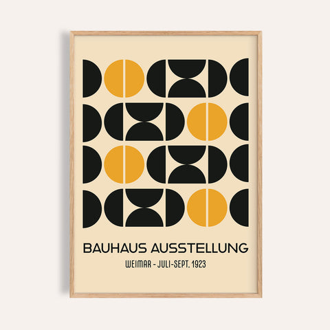
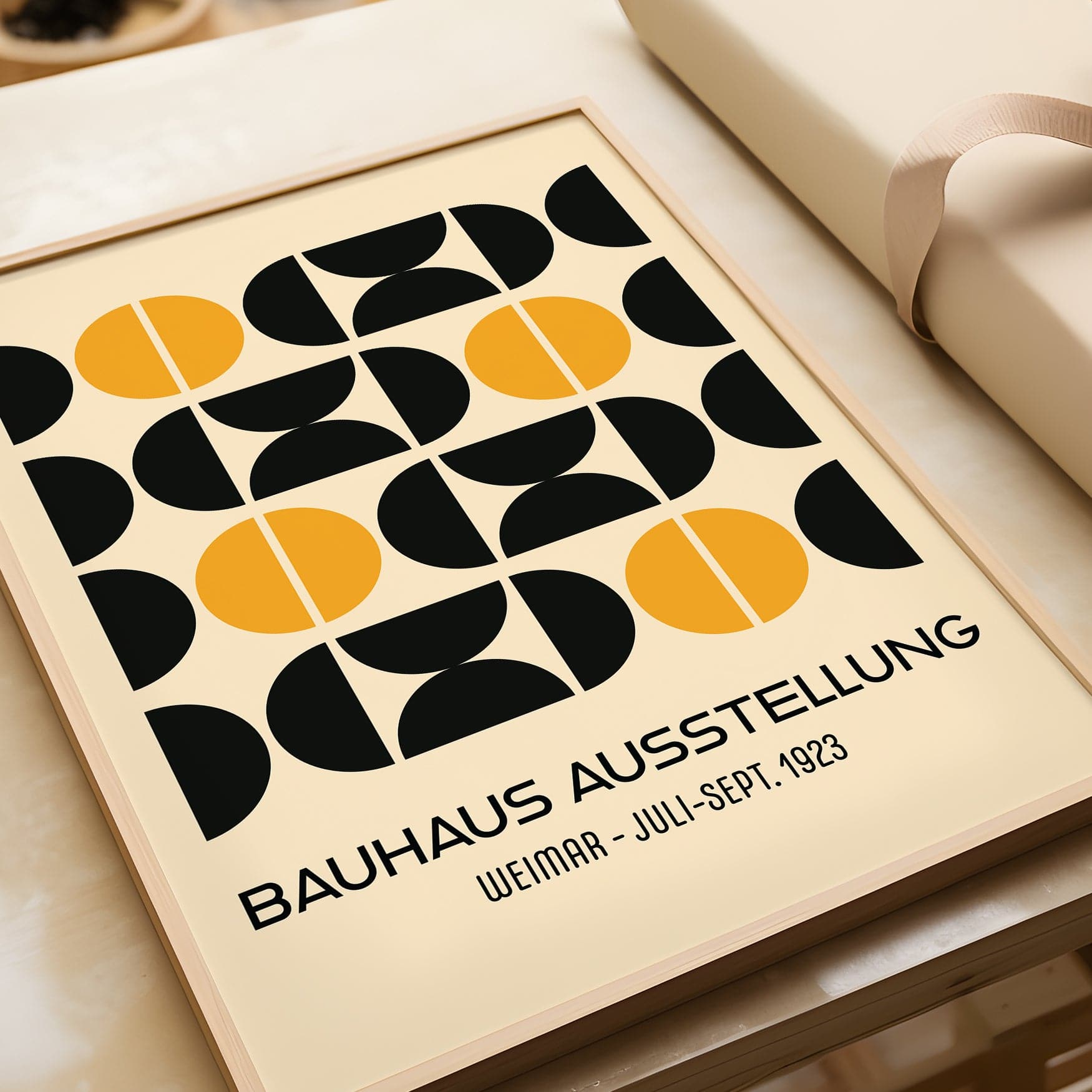
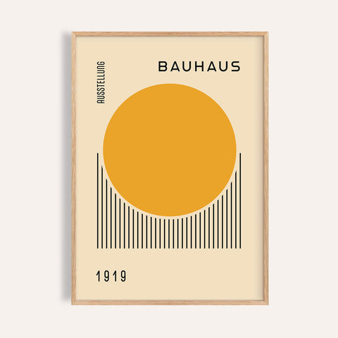
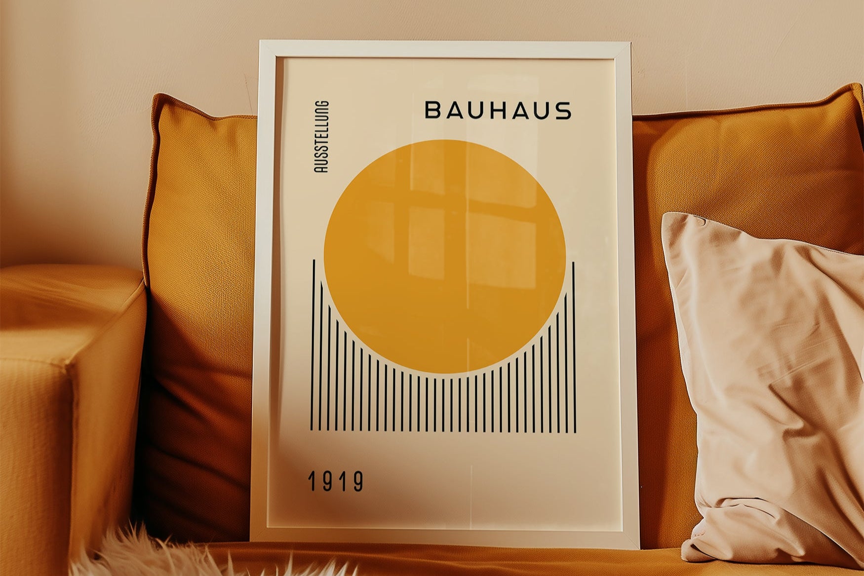
- Neutrals: Beige, ivory, greys, and warm whites provide a calming, adaptable base
- Earth tones: Soft terracotta, clay, ochre, and sage offer warmth and connection to nature
- Monochrome: Black and white or varying shades of a single color create bold contrast with balance
- Muted pastels: Dusty blues, faded blush, and sand tones bring softness without being overly decorative
These palettes work in all types of interiors and are easy to pair with other minimalist materials like wood, stone, or linen.
Choosing Colors to Match Your Space
The color of your poster should support the room’s purpose and palette. Ask: What emotion should this space evoke?
- For calm and rest: Choose soft greys, warm whites, or pale taupes
- For warmth and grounding: Try muted earth tones—terracotta, sand, or olive
- For clarity and focus: Use high-contrast monochrome or layered neutrals
- For softness and intimacy: Look for warm beige, blush, or faded clay
You’ll find many of these tones in our Bauhaus poster collection, curated for light-filled, minimalist interiors.
How Poster Colors Interact With Light
In minimalism, light becomes part of the design. Posters with light or neutral tones reflect natural light, helping a space feel larger and more open. Darker pieces add contrast but can absorb light—ideal for grounding a bright room or framing a focal area like a bed or sideboard.
As the light changes throughout the day, so will the impact of the colors in your wall art. Consider this dynamic when choosing placement and tone.
Creating Balance With Color Groupings
If you’re styling multiple posters together, keep their palettes connected. Use tones within the same family (e.g., warm greys and off-whites) or contrast one darker piece with two lighter ones. When grouped intentionally, color repetition across artwork creates flow and unity without needing perfect symmetry.
Final Thoughts
Color in minimalist wall art doesn’t have to be loud to make an impact. When used intentionally, even the quietest tones can shape the feeling of an entire room. Whether you’re curating a single focal print or a trio of tonal studies, your choices in color will bring the design to life—calmly, beautifully, and without unnecessary noise.