Designing a Minimalist Home: Posters That Pull It Together
A minimalist home isn’t about doing without—it’s about doing just enough. The structure is clean, the materials are simple, and the feeling is calm. But even the most thoughtfully designed space can feel unfinished without something to anchor the walls. That’s where minimalist posters come in. When chosen with care, they add visual balance, reflect your style, and help tie every room together without adding clutter.
Why Posters Work in Minimalist Interiors
Minimalist posters offer art that’s quiet, intentional, and designed to live in harmony with the rest of your space. Their simplicity supports your aesthetic instead of competing with it. Whether you're drawn to bold shapes or subtle line work, the right poster becomes part of the architecture of the room—adding form and focus where it’s needed most.
Unlike gallery walls or overly ornate artwork, minimalist prints allow you to decorate with clarity. They're low-maintenance, affordable, and versatile—perfect for any room that values calm and cohesion.
Poster Styles That Suit a Minimalist Home
The best choices are rooted in balance and negative space. Some go-to styles include:
- Abstract shapes: Simple color blocks and geometric forms, often in muted tones
- Line drawings: One-stroke or minimal ink illustrations that feel expressive without excess
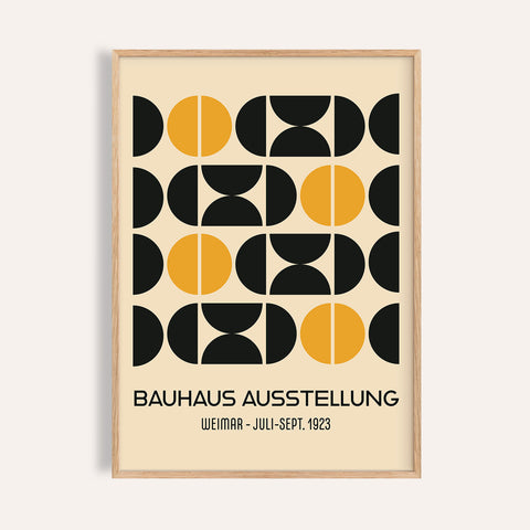
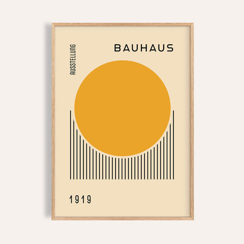
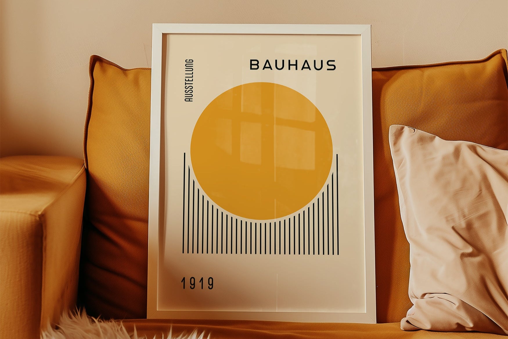
- Bauhaus-inspired compositions: Structured, clean, and playful with a modern edge
- Soft color studies: Gradients or layered tones in beige, taupe, or soft clay hues
You can explore several of these styles in our Bauhaus poster collection.
Room-by-Room Poster Styling Tips
Here’s how minimalist posters can enhance different areas of your home:
- Living Room: A single large poster above a neutral sofa, framed in oak or black
- Bedroom: A pair of complementary prints above the bed for visual symmetry
- Office: Clean abstract prints that support focus and reduce visual noise
- Dining Area: Horizontal prints or soft color studies to complement a wood or stone table
- Hallways: Vertical posters to guide movement and create gentle structure
Don’t overfill the space. Minimalist wall art needs room to breathe, just like your furniture and accessories.
Framing and Placement
Use slim frames in matte black, white, or natural wood. Float mounting or wide matting can help highlight the negative space and let the artwork speak for itself. Hang posters at eye level and allow at least 4–6 inches of breathing room from nearby furniture or decor.
If you're using multiple pieces, align their top or center lines and keep spacing consistent—usually between 2 and 4 inches apart, depending on size.
Final Touches That Make the Art Feel Integrated
Let your decor echo the themes of your posters. If the art features curved lines, bring in round vases or soft-edged textiles. If the tones are earthy, use wood, stone, or woven elements in nearby furniture and accessories. It’s this thoughtful repetition that gives the whole space a sense of visual rhythm.
Final Thoughts
Designing a minimalist home is about more than empty surfaces—it’s about choices that speak clearly. Posters give your walls that voice without overpowering your space. They offer just enough detail to guide the eye, frame a room, and create continuity from one corner to the next. Choose well, and your wall art will do what all good design does—blend seamlessly into the life you’re building inside it.


